
Lecture 6:
Let's Try This a Different Way: Statistics
Statistics are the most convincing form of evidence you can use. People believe in numbers--they believe that numbers are real, and that they don't lie. But like any other form of evidence, they can be made to lie or mislead, so you have to be careful and vigilant when examining statistics.
Here's an example:
Let's say I work for an advertising agency, and my agency is being paid millions of dollars to come up with a national commercial that will convince people to buy their toothpaste. I come up with a commercial that says, "Two out of 3 dentists prefer ShinyTeeth Toothpaste."
Now, I can't just make up that number. That's against the law, and the fines for violating consumer laws are huge. So I begin calling dentists and asking them if they prefer ShinyTeeth Toothpaste or AnotherAnonymous Toothpaste. Of the many dentists I call, most of them say they have no preference. But 2 of them say they prefer ShinyTeeth, and one says he prefers AnotherAnonymous.
Two plus one is 3.
Thus, 2 out of 3 dentists prefer ShinyTeeth.
Now, when consumers see the commercial, they assume 2 out of 3 means two thirds. But it doesn't; it means literally 2 out of 3.
My agency hasn't lied, and is within the law. But the ad is nevertheless misleading. The statistics don't mean what you think they mean.
Averages
Here's another example, using averages.
"Average" sounds like a real thing to most people. You get an average with numbers, so it must be right. Right? Here's the problem.
"Average" means nothing unless you know a lot of things.
First, there are three methods of averaging: the mean, the median, and the mode. Here's what each one means (don't worry about memorizing these; I'll give you an example in a minute so you can see how all this works):
- The mean average is the total sum of a group of numbers divided by the number of numbers in the group.
- The median average is the number that falls halfway between the highest and lowest numbers in the group of numbers.
- The mode average is the number that appears most often in the group of numbers.
Okay, that's a bit confusing. Here's an example, so you can see how this works:
Let's say I am averaging your grades for this class. Here are your grades, in the order that you received them:
95
80
65
75
95
40
- If I use the mean average to arrive at your grade, I add all of these numbers and get a total of 450. Then I divide by the number of numbers. There are 6 grades, so I divide 450 by 6; the average is 75. That's a C.
- If I use the median average, I calculate what number is halfway between the highest number (95) and the lowest number (40). That's 67.5 That's a D.
- If I use the mean average, I use the number that occurs most often in the group. The only number that appears more than once is 95. That's an A.
See what a difference the method of averaging makes? And before you assume that the mode average will always be the one you want me to choose, think about this: what if the only number that appeared twice was a 40? That would be an F.
So the word "average" has no real meaning unless you know the method of averaging and the actual numbers that were used in the calculation.
But wait--it gets even better. Let's say I tell you that the median temperature of a city is 75 degrees. We know that the median is halfway between the highest and lowest point on the scale. So what could the range of temperatures be in this city?
Think about it for a minute.
The range could be 74-76. It could be 70-80. It could be 50-100. It could be 0 and 150.
It could, in fact, be any pair of numbers that have 75 as their midpoint. So even if you know that the method of averaging is the "median," you still don't know what the range of numbers is, so that "75" means very little.
So even if you know what the method of averaging is, you still have more questions to ask.
Surveys
Surveys are another form of statistic that can be quite valuable. But like any other statistic, they can be skewed easily, so you have to pay attention closely to the results.
Here's an example:
Let's say I report that, of those surveyed, 100% believe in Santa Claus.
How did I get that result?
Well, easy: I only surveyed small children. If you go to the mall and ask the kids in line to see Santa, I can pretty much guarantee you'll get a unanimous "yes" to this question.
So you have to be careful of surveys: often, the person doing the survey has an agenda and wants it to come out a certain way. There are ways to make this happen.
One way is to survey those you know will agree with a certain viewpoint. If I want my survey to show that the majority of people believe abortion should be legal, I will survey those working at a Planned Parenthood clinic. If I want my survey to show that the majority of people believe abortion should be illegal, I will survey people coming out of a Catholic Church after Sunday mass.
There are a number of other ways to bias a survey; sometimes this is done on purpose, other times it is done accidentally. Go to this article by Craig Charney, of Charney Research, for some funny and not-so-funny examples. This article was written in 2007, but the methodology still applies.
The Top Ten Ways to Get Misleading Poll Results
And this brings me to another type of statistic you need to watch out for:
Percentages
Let's go back to one of my previous examples: 100% of those surveyed believe in Santa Claus.
How many kids did I have to survey to get those results?
One.
If I surveyed one child, and he said, "Yes, I believe in Santa Claus," then that's 100% of those surveyed. So percentages can be misleading.
Here's an example: My parents used to live in North Idaho, and there was a weekly paper in a nearby town, Rathdrum, Idaho. One week, the paper got everyone buzzing with its headline: "Murder Rate in Rathdrum Increases by 100%." Everyone was shocked...until they read the article. Then it turned out that the previous year, only one murder had occurred: a man was killed in a bar fight. During the current year, there had been two murders: a man came home and found his wife in bed with another man and killed them both. So the actual number of murders rose from 1 to 2.
But think how that percentage would translate if this had happened in Los Angeles: 692 people were murdered in Los Angeles County in 2016. If the murder rate increased by 100%, it would rise to 1,384. That's a huge number...but it's still 100%.
Here's another example: Let's say I make a product--maybe I make special lighted and magnifying eyeglasses, designed for senior citizens or other people with impaired vision. I want to advertise and sell my eyeglasses. So I choose to offer them for sale in the AARP Magazine, which has a circulation of approximately 23 million people. My profit on each pair I sell is $1.00. (In real life, it would probably be higher, but I just want to make the math easy.) I can expect a return on my ad of about 1%. (That is, about 1% of the people who see the ad will buy my eyeglasses.)
One percent? That doesn't sound like much!
But let's do the math: If 1% of all the readers of the AARP Magazine buy a pair of my glasses, I would sell 230,000 pairs of glasses. At $1.00 a pair, I would make a profit of $230,000. That's a decent amount of money for one ad. So in this case, 1% translates to a large number.
The obvious lesson is that percentages don't really mean much unless you know the actual number behind them.
Charts and Graphs
These are perhaps the easiest statistics to distort, partly because people understand them even less than they understand numbers, and partly because they are simply a visual representation of numbers, and visual representations are so flexible.
Let's say Bob Miller is running for mayor. He has never held public office before, and doesn't really have a record of achievements he can publicize, so his main tactic in the campaign is to make his opponent look bad. He tries to think of an issue about which people feel very strongly, and he comes up with crime: people don't like to hear that crime is rising in their city.
So he does his research and he finds that his opponent, Sara Shay, who has been mayor for the past 6 years, is actually doing a pretty good job on crime. Under her administration, crime has risen only from 10-12%. The first graph he makes looks like this:
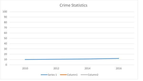
That's not so scary, and won't get him any votes.
So he makes a second chart:
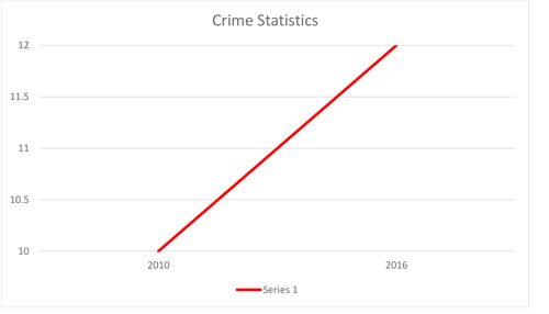
This is much better for his purposes! If you look, you can see that the numbers are exactly the same: the first graph shows a rise from 10-12%, but the numbers on the left side run from 0-100, and the years on the bottom are more spread out. To get the line to slant more dramatically, he simply changed the numbers on the left side so they run from 10-12, and the years along the bottom list only 2010 to 2016 and are thus much closer together. The line is now bright red.
Most people will not look at the numbers along the side or the bottom of the graph. They will look only at the line, and they'll be shocked. And they'll think Mayor Shay has been allowing criminals to run rampant, and they'll vote for Bob Miller.
This is just the tip of the iceberg with statistics; I've only given you a few examples of the ways statistics can be suspect. The rule with statistics: always be skeptical, and if it's an issue that matters to you, do your homework!